News Flash: The lucky postcard winners are Kathy Rose, Lois Rotella, Marcia Kennedy, and Sue Leis! Ladies, congratulations, and please write Edith at edith@edithmaxwell.com
Edith/Maddie north of Boston, where it’s still pretty wintry out there despite being a month from the start of spring.
I might have mentioned here (over possibly the last four years…) that I’ve been writing a new historical novel. I’m delighted that a March 12 release date for A Case for the Ladies, a Dot and Amelia Mystery, is finally in sight!

After various queries, I decided to take full control of my baby’s publication. Here’s the blurb:
Amid Prohibition, Irish gangs, the KKK, and rampant mistreatment of immigrant women, intrepid private investigator Dorothy Henderson and her pal Amelia Earhart seek justice for several murdered young women in 1926 Boston. As tensions mount, the sleuths, along with their reporter friend Jeanette Colby and Dot’s maiden Aunt Etta Rogers, a Wellesley College professor, experience their own mistreatment at the hand of society and wonder who they can really trust.
I wanted this book to be a professional product, so I hired a line editor, a proofreader, a book designer/formatter, and a cover artist. Book designer Brian Shea has been amazing, proposing different options for chapter openings, fonts, line spacing, and so much more I never would have thought of. (He also happens to be long-time mystery author Susan Shea‘s son, so he knows the subject matter.)
Today I want to share the evolution of my cover with you. Many of us Wicked Authors who are published by Kensington and other traditional firms have shared over the years that we get (if we’re lucky) cover input before the artist goes to work. After that? By the time we see the cover, in general it’s too late in the complicated corporate release schedule to make any changes.

I’ve been enjoying how different my current process has been from that with a big publisher. After some investigation, I hired Gail Azdid of Desert Isle Design to present the visual face of my book to the world. Last year, she designed the cover for my Quaker Midwife short story collection, which I love. We had a few back-and-forths about details of Dot and Amelia’s era, and Gail was always happy to make changes.
She began by asking me for my ideas about this new cover. I described the 1926 era, the Boston urban setting, the Denison settlement house, and where Aunt Etta lived on Beacon Hill. I added the personal styles of Dot Henderson and Amelia Earhart, and detailed the important vehicles in the story: Amelia’s Kissell speedster, the Kinnear Airster she flew, plus other mid-twenties automobiles and older horse-drawn wagons still on the road. I sent Gail photographs and web links.
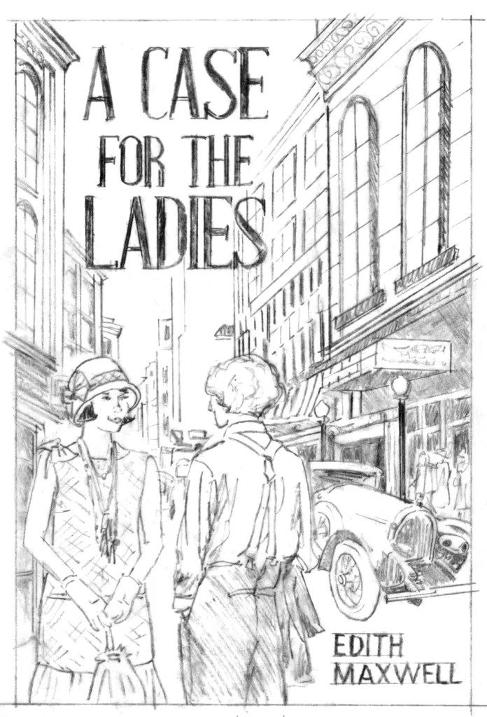
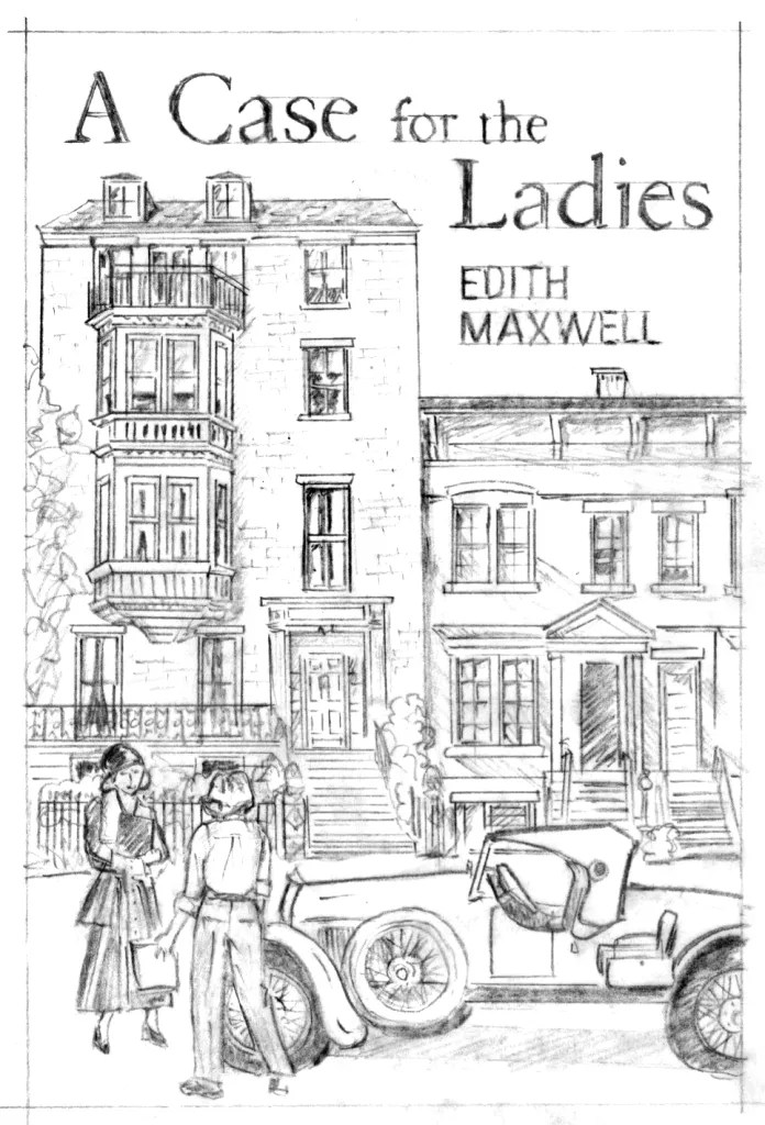
She came back with three sketches for me to look at. The first depicts a busy Boston commercial street. The second shows the settlement house, but isn’t exactly what I’d seen in the photographs. The third is the Beacon Hill setting.
I liked all of them, but I decided the city street in the first one was the backdrop I wanted.

Then we waded into clothing. I knew Amelia wore dresses to teach in, but I’d written into the story how fond she and Dot were of wearing trousers. I also knew Amelia rarely wore hats or carried a handbag, while my fictional Dorothy loves wearing and buying toppers. The more stylish the cloche, beret, or boater, the more Dot covets it.

In the end, depicting Amelia from the back in a dress, even with a good showing of her height and tousled hair, didn’t seem to work. But I didn’t like the suspenders look, either. I also realized women of the era rarely wore sleeveless dresses on the street, even though this story takes place in late July and early August.
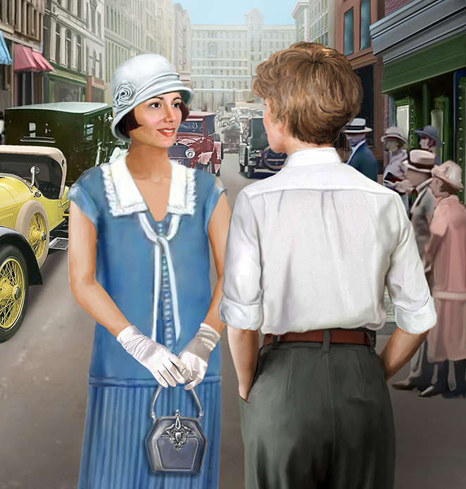
We got closer with this draft. I suggested it would be fun to include an airplane like Amelia’s Kinner Airster in the distance. Brian, the book designer, got involved with the cover at this point, proposing different fonts for the cover. He also worked on the book spine and the back cover.


So many choices! Title font. Big airplane, small airplane. Author name color and case. And more permutations I don’t show here.


Wow. More choices! Luckily, Brian is a patient sort. He kept saying, “It’s your cover. I want you to be happy.” He put up with all my mix-and-max choices. In the end, I cut down the bio, added a clip from one of the fabulous endorsements my book has received, and made a few more changes.
In the end, here’s the final product.

Do you love it as much as I do? I also worked extensively with Brian on the interior, a similarly fascinating and detailed process I don’t have room to go into here. I did learn the term “objective correlative.” That’s what you call the small airplane graphic tucked onto the first page of each chapter, the same Kinner Amelia flew that’s featured on the cover.

I wish I had a Case for the Ladies pre-order link for you, but that will come in time, and for sure by March 12, when the book will available in paper and ebook wherever books are sold!
Readers: What do you look for in a book cover? Do you judge a book by what’s on the outside? I will send five lucky readers a 1920s cocktail recipe card!

I love seeing the progress from conception to final cover. I love your final cover. As I a visual person, the cover will attract my eyes first.
LikeLike
Thank you, Dru! That means a lot.
LikeLike
I am one who judges a book by its cover lol! I often go back to it as I’m reading, helps me to visualize the story. The old cars on your cover are so cool! You certainly have to go through quite a process to get the cover and insides done, wowza!
LikeLike
It’s been interesting having so much input and seeing how it happens.
LikeLike
I don’t know why that posted as Anonymous, I’m kathylynn103@hotmail.com.
LikeLike
Ha, no worries, Kathy Lynn!
LikeLike
This was a great article, I had always assumed authors had a lot more to say about their covers, but this makes sense to me now as to why so many book covers look so similar. If I see a book cover that one author used and then see a bunch of authors/publishers using almost the same cover, it turns me off from selecting those books. I love to look at the covers it helps me visualize the story and characters better. And yes, I know you should not judge a book by its cover but when it comes to books I buy I can’t help myself.
LikeLike
Thank you, Kathy!
LikeLike
It has really been nice learning how the cover came to be. The cover usually first attracts me to a book then the title followed by the blurb on the back.
LikeLike
Thanks, Lois!
LikeLike
Wow, I love the progression from first draft to final cover went. Seeing it come to life from those first sketches to what will be the published book sure was fun.
I don’t particularly look for anything in a book cover. When perusing the store shelves, a cover might get me to pick it up off the shelf but it won’t make me buy a book. I’ve said it before that it is the synopsis on the back cover that will make me decide on if I’m going to buy the book.
I’m so looking forward to the publication of A CASE FOR THE LADIES. It’s been a long road but seeing it just a few weeks from being birthed into printed form makes me excited to read it!
LikeLike
Thank you, Jay! (Readers should know you read a very early version of this story – I hope you love the finished product.)
LikeLike
Thank you, Edith, for the “peek behind the curtain”. In reading “The Wickeds” and “The Reds” on the cover process, “Don’t judge a book by its cover” has a clearer meaning for me. More covers distort what is inside them. A favorite mystery series of mine describes the protagonist with blond hair, “guileless blue eyes”, and a “cuddlesome” body. The covers show all hair colors but blond, dark eyes, and runway model thin bodies! Looking forward to reading what is between this new cover!
LikeLike
Thanks so much, Elisabeth!
LikeLike
Thank you for a fascinating look at the process. I love the finished product.
LikeLike
You are welcome!
LikeLike
This article is very interesting. I know I shouldn’t, but I do judge a book by it’s cover, unless it’s an author I like. I prefer the covers from traditional publishers. I’m not usually fond of covers that are mostly just a solid cover. Kudo to you, this cover looks, to me at least, like one from a traditional publisher. I added it to my list and am anxious to read it. sue.stoner72@yahoo.com
LikeLike
Thank you, Sue.
LikeLike
Nice cover, Edith! Congrats on the new project!
LikeLike
Thanks so much, Diane.
LikeLike
Oh my – I absolutely LOVE this cover! Yes, I’m one that often times lets the cover decide the book – especially if it’s by an author I don’t know. The cover, while not the “meat” of the book, should give the author a glimpse of what to expect within the pages. This cover shows a little mini story in just one look. You know the era, the style of the day, the main characters and so much more.
I have to admit, when search through book stores (when not there on a direct mission), it is the cover that will draw me in. One can often tell if it’s a cozy, a mystery, and how graphic the story may be just by looking at the cover. Honestly hadn’t thought about how much work that went into the development of a cover. Imagine it was hard to leave all the details to someone else and not have control of how your “baby” was handled. And I can imagine how fun it was to have that control on this book. Good for you! Between your ideas and the insight of your crew giving you ways to make it better, you have come up with an exceptional cover that is bound to draw all other cover lovers to this book.
Now I have to be patient and wait for the opportunity to read and review the story inside the cover.
2clowns at arkansas dot net
LikeLike
Thanks, Kay – it was a different process, for sure.
LikeLike
It’s a great cover, Edith. Thanks for sharing the process!
LikeLike
Thanks, Liz!
LikeLike
Years ago I attended a talk by a book cover artist. It was fascinating. I like an inviting cover that I can see myself in. I enjoyed your explanation of your process with this cover. I also enjoy making cocktails! I know the 20’s where the heyday of cocktails.
LikeLike
Perfect. Glad you enjoyed the post, Susan.
LikeLike
Thrilled for you Edith. Thank you for taking us through the process. Looking forward to preorder day.
LikeLike
Thank you, Kait!
LikeLike
Edith, it looks fabulous! Truly stunning. I can’t wait to read it. Congratulations!
LikeLike
Aww, thank you, my friend!
LikeLike
Many times the book cover is what draws me to a book. Then reading the description of the books contents.
LikeLike
Agree!
LikeLike
What a great cover! And thanks for showing us some of the process involved.
And I must admit, a good cover will have me reaching for the book and turning it over to read the back cover copy.
LikeLike
I’m glad you like it!
LikeLike
CONGRATULATIONS!!!!!!!!!!!!Thank you, Maddie/Edith for starting our week with such a fun blog!!! I have been looking forward to reading A CASE FOR THE LADIES, and your description of how the cover came alive is truly fascinating!!
I am always doing constant research on what my favorite authors are going to have published in the near or far future…I preorder them, no matter what. In the meantime, I research mystery and historical mysteries online, and I confess, I am looking at the covers first, and if they are not attractive to my eyes, I pass. I love colorful covers that show interesting drawings of what may be sleeping between the covers for me to discover…if there is a cute animal, the better. Exceptions are some books like The Maid, Thursday Murder Club, and Anthony Horowitz’ books., but those are rare. It seems that now many new authors are copying the look of The Thursday Murder Club, but I don’t fall for that… Thank you for always sharing such interesting facts about the “behind the scenes” of writing a masterpiece, Maddie/Edith! It is such a joy to read all of your books. Luis at ole dot travel
LikeLike
You’re the best, Luis!
LikeLike
It’s a great cover and I love reading about your process. I know it will be a big hit!
LikeLike
Thanks so much, Sherry. Fingers crossed!
LikeLike
Wonderful cover! So many things to consider….
LikeLike
Thanks, Barb. I had no idea how many!
LikeLike
Thanks so much for sharing the process! So many decisions to be made.
LikeLike
Edith,
I Ioved reading about the process of creating a cover from start to finish. So many choices. The end product is fantastic.
LikeLike
Thank you, Marilyn!
LikeLike
Well done, Edith! This is fascinating, the book sounds wonderful, and the final cover is terrific.
LikeLike
Thanks so much, Molly!
LikeLike
What a journey! The cover will often get me to pick up a book, but it is the blurb on the back that usually seals the deal for me, unless it’s a favorite author, then I will likely just get the book. This one sounds like tons of fun. Looking forward to it.
LikeLike
Thanks so much, Marcia.
LikeLike
I got the same great design support from Brian when I decided to re-publish the three-book Dani O’Rourke series, having gotten back the rights after they went out of print. As you say, so many choices, so much to think about! But, like you, I love the results. May I add I’m proud that Brian’s my son, although I take no credit for his talents!
LikeLike
He’s been great to work with Susan – thanks for passing along his name!
LikeLike
First and foremost, I want a cozy mystery. Title and cover are usually (or should) tell me that. I want the cover to match the details in the story. I hate when the story says one protagonist is blonde and the other is brunette, only to have the cover show two blondes. Generic covers turn me off. I find most the of the Wickeds’ covers to be very satisfactory. And I love the final cover choice for A Case For the Ladies
LikeLike
I agree about matching, Ginny, and I’m delighted you love my cover!
LikeLike
It looks great. But all those decisions! As the world’s most indecisive person (maybe), it would drive me crazy trying to make all those decisions.
LikeLike
All the decisions were tricky, for sure!
LikeLike
I do enjoy a good cover and title but the blurb is what makes the story interesting
LikeLike
Agree, Deborah.
LikeLike
I think you put together a very enticing cover with the help of your talented cover artist. I think it will draw readers not familiar with your work to pick up the book. Kudos for showing Dot’s face! I don’t care for the trend to show the protagonist only from the back which so many historical fiction books do. And thanks so much for explaining what an objective correlative is. I love learning details like that. The process to create a book from initial idea to finished product is fascinating!
LikeLike
Faces are tricky, but I decided to go with the artist’s rendition. That term is totally down to Brian – I had never heard it before!
LikeLike
To a certain extent, I do judge a book by its cover. But it’s the author, description and blurbs are what sells me on the book.
LikeLike
I hear you, Dianne.
LikeLike
What a wonderful post, and fascinating journey. I’m so happy for you Edith! How wonderful that you have a great team to help you with your baby.
LikeLike
Thanks so much, Julie!
LikeLike
Thank you for sharing the evolution of your cover. I love covers with bright colors like yours. I definitely am someone who is attracted to the cover first.
LikeLike
I’m glad you like this one!
LikeLike
Love, love, LOVE this final cover! Gorgeous. Also love the “objective correlative” of the plane inside the book. Cannot WAIT to read A CASE FOR THE LADIES. And I’m so glad you hired professionals for the cover. Cheesy, poorly designed covers that scream “self-published” make me skip the book. If the cover’s poorly executed, it makes me question the content.
LikeLike
Thank you, Laura!
LikeLike
What a fun art project! The first thing I notice is author’s name, but I enjoy the embellishments of the covers as a bonus, and learning the process is fascinating. ❤
LikeLike
I thought so too!
LikeLike
So fascinating! I always picture the author typing “The End” and perhaps doing some final rewrites/edits later. But of course that’s an erroneous assumption!
LikeLike
That’s more true for a traditionally published book, Linda, but not for this one.
LikeLike
The cover is crucial! Good job on this one, by the way. I can’t wait to read it. I see the plane flying over and recognize Amelia (big fan). The well-dressed lady addressing her seems sweet, friendly, and competent. Stopping in the middle of a busy city area. What are they talking about? Is that really Amelia? What is this story about? I would definitely pick this up and turn it over to read the blurb. Absolutely. The cover is what makes people pick it up! Then you need to keep it going with a killer blurb but if your cover is benign, it’ll be passed by. (By me, at least.)
LikeLike
Thanks, Becky! I hope you love the story inside, too.
LikeLike
I admit the cover is the first thing I notice after the author’s name. Since I already read your books, I would take this book off the shelf just because I love your writing style. If you were a new-to-me author, the cover would be the pull for me. I really love all the details on a cover and especially appreciate when the character, or town, or store, etc are shown. It helps me imagine it in the story that much easier. aprilbluetx at yahoo dot com ps – I really love this cover!
LikeLike
Thank you, April!
LikeLike
I love that you shared each step of this process that you went through until the final product. It was fascinating to watch and read. I graduated with a Bachelor of Fine Arts degree in 1972, so I am always drawn to well done covers. I dislike some of these new animated cartoonish looking ones. I usually don’t buy those. I do like a good cover and look at that, but that only counts on new authors now. I would buy any book despite its cover if it was by a favorite author. Your end product (having not read the book yet) seems to be spot on. Hannah Dennison’s Honeychurch Hall books started out with really good covers and then by the fifth book they changed to an animated cartoonish looking cover. I still buy them as I like her books but am not happy with those covers. Looks like Thurber’s dogs which were great for Thurber. Jennifer J. Chow’s LA Night Market covers are cool as they look like vintage drawings. So, covers do matter. Keep up the great work. And I love the airplane flying throughout the beginning of each chapter. As they say in incorrect English, Brian did good with your input. That is a winner. They should have an awards category for the book cover artists at the book awards.
LikeLike