by Barb in Key West, where I can’t complain (because everyone would jump on me if I did.)
One thing I haven’t been good about publicizing is the covers, some of them so well done, that are created for my books when they come out in other formats, like audio books or large print. When these alternative formats are released simultaneous with the print and ebook editions, I tend to use the print covers for publicity. When the other formats come out subsequent to a book’s initial publication, I don’t usually mark the release in any particular way.
So I’m going to make up for that now in one swell foop.
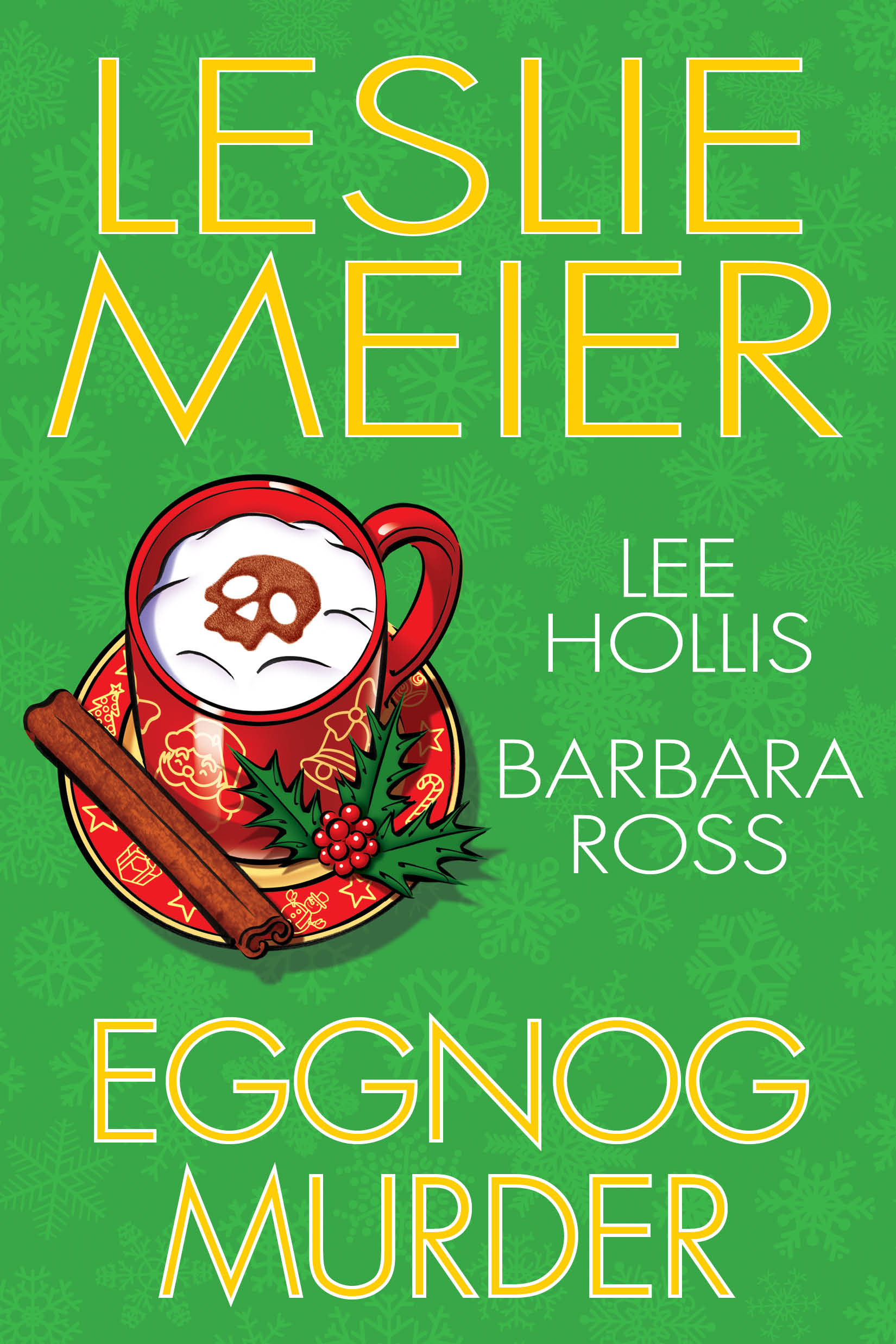
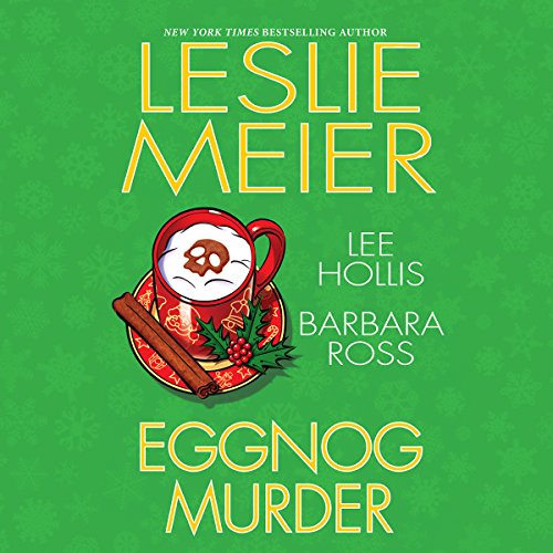
Sometimes the covers of all the formats are the same. For example for the novella collection Eggnog Murder.

Sometimes the covers are different.


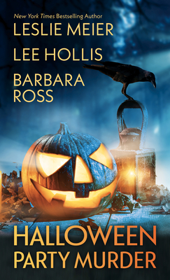
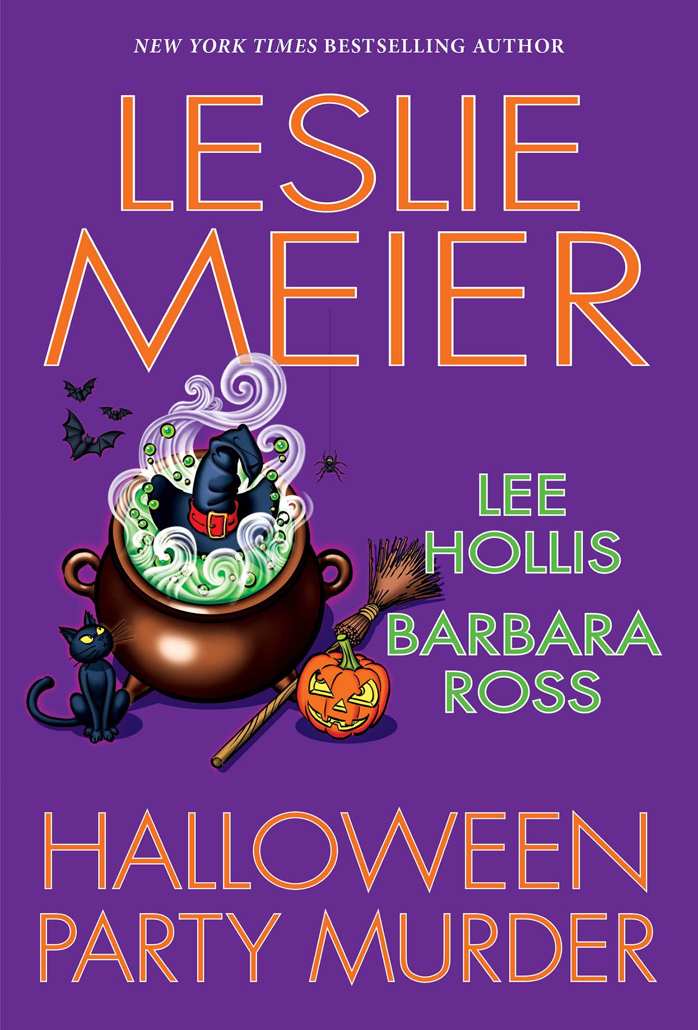
For Halloween Party Murder, the publisher, Kensingon, has changed the color of the lettering from the hardcover for the mass max paperback. They did this once before (with Yule Log Murder). I suspect it may be because the original color didn’t show up sufficiently in the smaller format, but I don’t really know. I kind of like the large print cover from Thorndike Press.
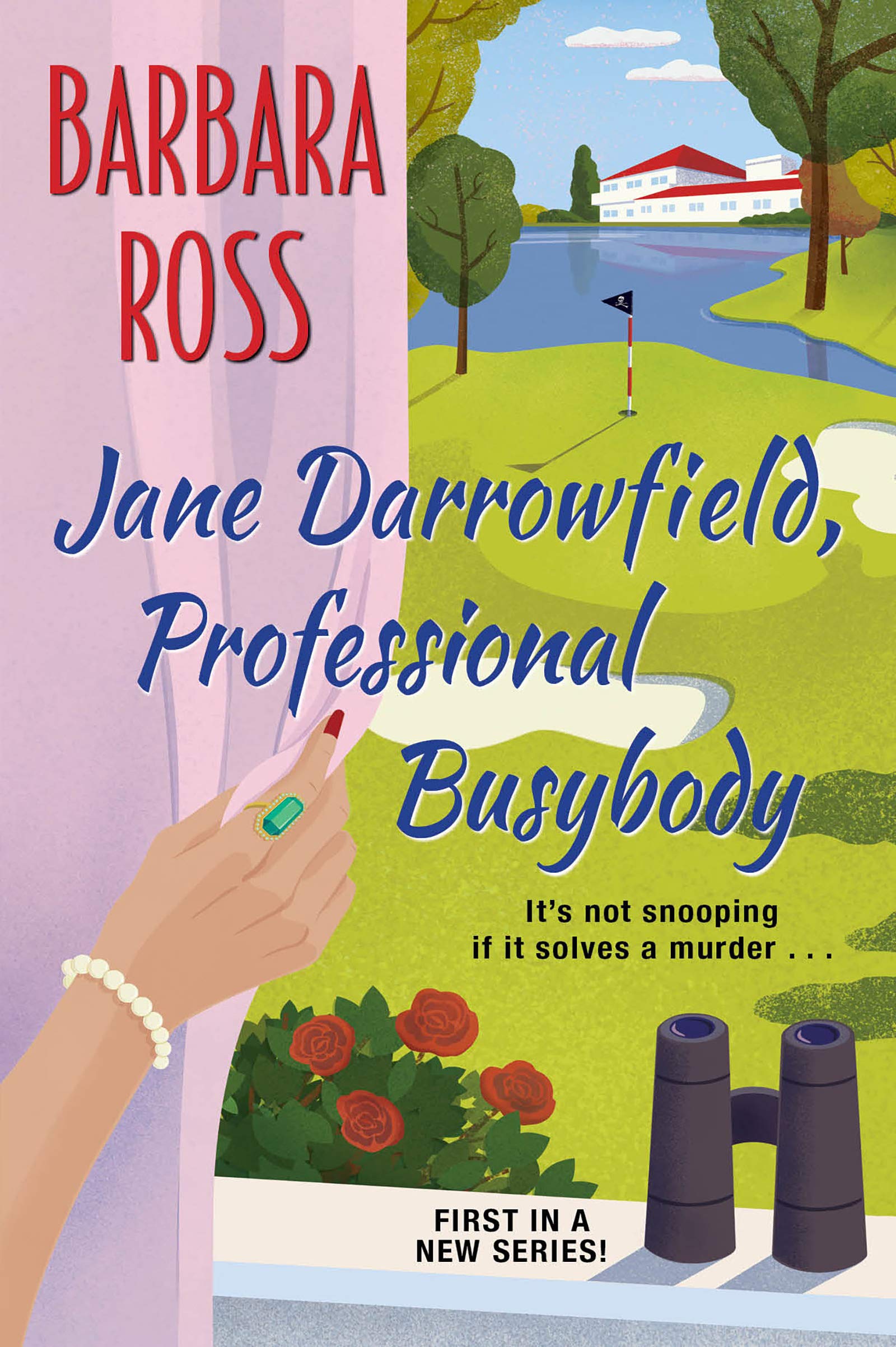
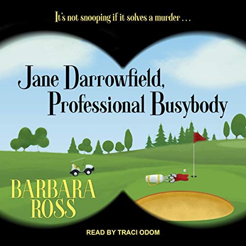

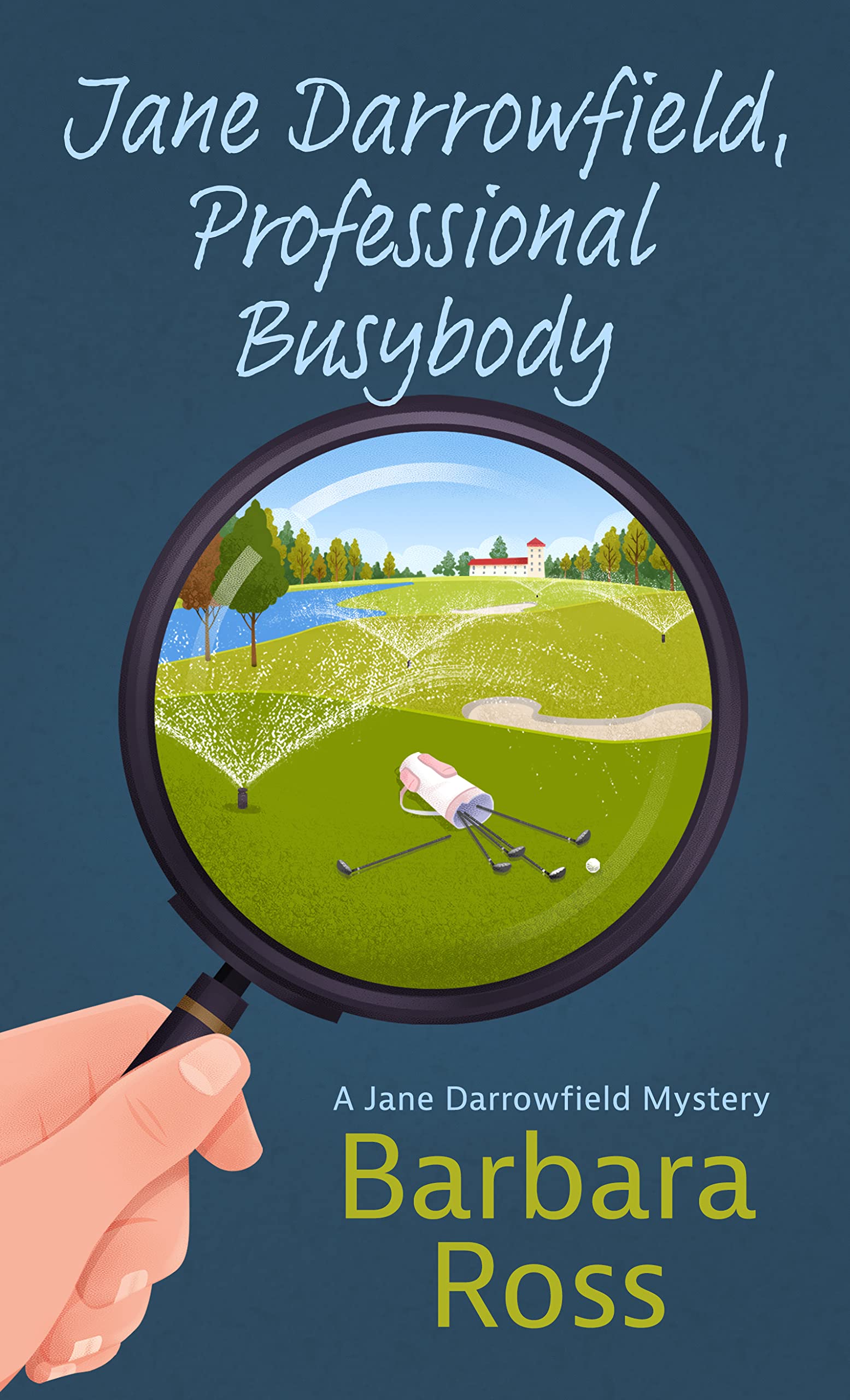
I really like the audio book and large print covers for Jane Darrowfield, Professonal Busybody. Of course, it’s weird to talk about covers for ebook and audio book downloads because they’re not physical objects and therefore can’t be “covered.” I suppose “cover” is better than “image by which we identify a specific collection of ones and zeros.”

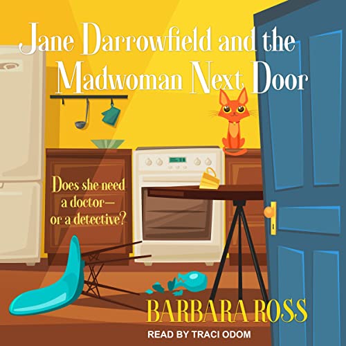

On the other hand, yikes! What is going on here? They’re all terrible and way too busy considering the amount of text required by the title, Jane Darrowfield and the Madwoman Next Door. (Which is entirely my fault. My editor tried to warn me.) Sorry about the small size of the large print cover. That’s all that’s currently available
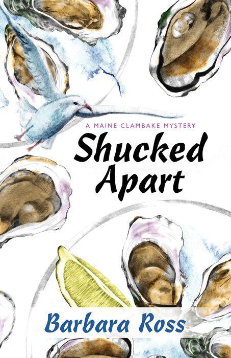
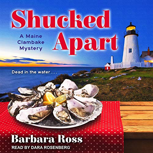
Large print covers are generally big and blocky with bright colors for the same reason the text is large–so people with low vision can see them. However, the publisher has gone a whole new way with the cover for Shucked Apart. I have no idea if it’s across the board change or particular to the Maine Clambake Mysteries.
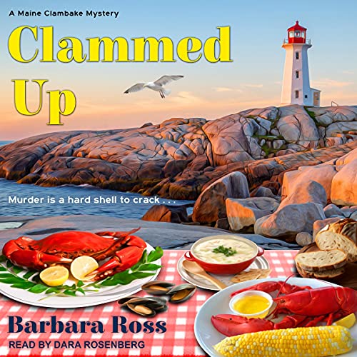
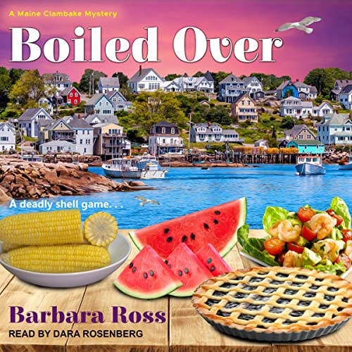
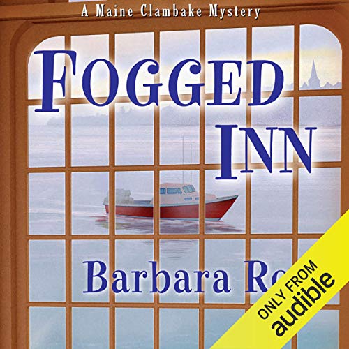
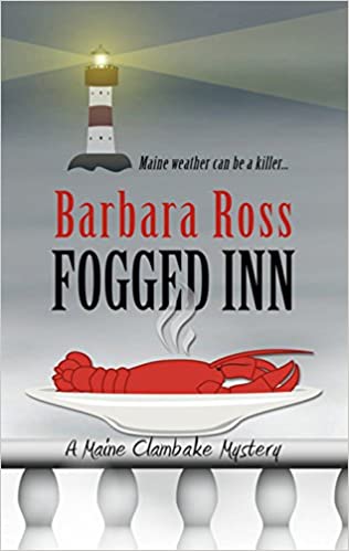
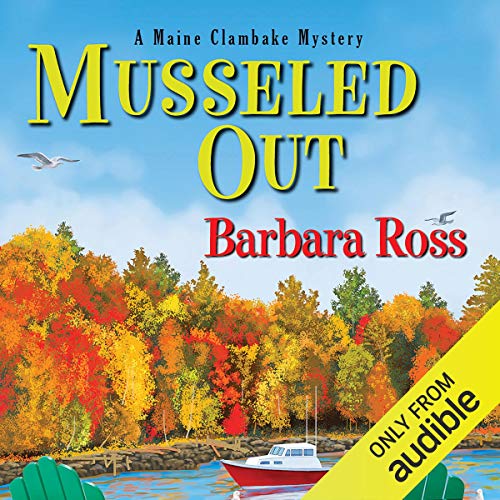
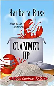
The rights to the audio books for Clammed Up and Boiled Over, the first two books in the Maine Clambake Mystery series, recently reverted from Audible. Tantor Media picked them up. Tantor kept the same recordings, but gave the audio versions spiffy new covers, which match the rest of their line. The audio books are selling better since the move, if my most recent royalty check is any indication. It’s probably not because of the covers. Tantor owns the rights to books five through ten, so it’s in their interest to get people started on the series. I hope they pick up the rights for Musseled Out and Fogged Inn when they become available.


Readers: What do you think? Any particular covers catch your eye? Do you hate any of them? Let me know in the comments.

I don’t care much for the Shucked Apart cover for audio. It doesn’t match the other covers for the series.
LikeLike
It is quite a departure.
LikeLike
I love all of your covers. I love your Maine Clambake series. We used to vacation in the area you write about when we lived in MA and I love to read about places I’ve been to.
LikeLike
Thank you so much!
LikeLike
I really like the Jane Darrowfield with the binocular view of the golf course. That’s something I would do! The Fogged in with the mostly gray cover is SO moody Miane. And I like the Shucked Apart artwork because it’s such a good display of the oysters, even though it’s not in keeping with the others in series.
LikeLike
I agree with all of these points.
LikeLike
I didn’t realize your books are also in large print, Barb. Always good to have an additional revenue stream! I agree about the too-busy Madwoman covers.
LikeLike
And I just learned my Cozy Capers series will start in large print next summer. Cool!
LikeLike
Great news, Edith!
LikeLike
good news!
LikeLike
The money for large prints hasn’t been huge, but they’re sold almost entirely to libraries, including libraries that don’t buy the paperbacks. So it makes the books available to more people. And of course, more accessible for those that need it.
LikeLike
BARB: Interesting how the covers can differ from format to format.
I DO LIKE the mass max Halloween Party Murder better, Yes, the font colour stands out more and orange is a better choice for colour since it is a collection of Halloween-based novellas.
And I agree with the JANE DARRYFIELD covers being too busy.
LikeLike
I agree about the color change in the lettering on Halloween Party Murder. The mass max color stands out more and is more halloweeny.
LikeLike
Really like the cover on “Halloween Party Murder” in the large print. For me it’s a toss-up between the paperback and the audio version of “Jane Darrowfield, Professional”. That being said, all of them would have me picking up the book to check it out if I didn’t already know the author – whose books I love reading.
2clowns at arkansas dot net
LikeLike
I agree on the Jane Darrowfield audio and large print covers. Too close to call.
LikeLike
I’m with Dru that the large print SHUCKED APART just doesn’t match the others. And you’re right about the MADWOMAN covers being awfully busy.
I do love the other large-print covers of the Maine Clambake series.
LikeLike
I have always loved the lerge print covers, too.
LikeLike
Thanks for the inspiration to test the colors and fonts on all sizes. I see the potential audience confusion. Except for the small number of issues raised by you and others, love ‘em!
LikeLike
They are great covers. I have been very lucky.
LikeLike
Of course I LOVE the mid-century modern furniture on the audio version of the Madwoman.
LikeLike
That is an interesting choice.
LikeLike
I love all the covers. ach is special in their own way, and if I was not familiar with your writing, I would definitely be enticed by all of them. Since I have read everything you have written…and loved them all, then I just have to continue to admire the cover for Muddled Through!!!!! Thank you thank you thank you!
LikeLike
I’m fond of the Muddled Through cover, too. There will definitely be an audio book version. No word on large print, yet.
LikeLike
Some of these are so cute, and others . . . well, I definitely agree with your opinions! But it’s always so interesting to see the different cover concepts. Thank you for sharing!
LikeLike
I find it so interesting, too.
LikeLike
Your large print Shucked Apart would make a great print to put on a kitchen wall, I really like it! And, I like the Jane Darrowfield covers, all of them. They are inviting me to read them or it feels that way to me.
LikeLike
You’re right. The Shucked Apart cover does have a really print-like quality.
LikeLike
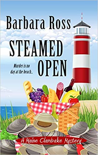
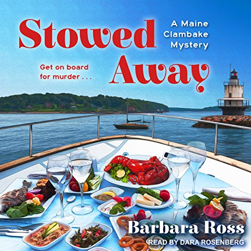
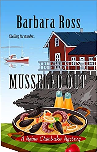
Any with lighthouses catch my eye, but the fall colors on Musseled Out are glorious!
LikeLike
I have always loved the cover of Musseled Out, maybe most of all. And it’s sales have always lagged the other early books. Is it the cover? Maybe the title.
LikeLike
Mostly I love your covers, by the audio Shucked Apart turns me off. It is consistent with any of the other books, so it doesn’t scream, “Read Me, I’m a Barbara Ross great book.” In general, I don’t like changes in covers. It just confuses me, which is a pretty easy thing to do.
LikeLike
It is quite a departure.
LikeLike
I like most of them for one reason or another. You’ve been pretty lucky with your covers.
I do have to laugh at the small cover you have for the large print of Mad Woman.
LikeLike
I have been lucky with my covers. For some reason Thorndike Press always releases the large print covers teeny-tiny, and puts them up on the general etail sites really late, like just before release. I don’t think they sell many that way. Most go to libraries.
LikeLike
I love all the covers. Thank you so much for sharing.
LikeLike
Oh wow, I love all the covers. Nice and eye catching. Thanks for sharing them!!
LikeLike